Babahoola: The eyes of a child
Babahoola, a British children’s decor brand was founded under the belief that every child can live their full potential when their curiosity and confidence are nurtured. Seeing the revelation and magic of discovering something for the first time through the eyes of a child is a wondrous thing, and this became the the powerful starting point for our rebrand. We wanted children’s spaces at home to transform into places for young open minds and hearts to thrive; places that can also reflect and celebrate the wonderful and unique personality in every child.
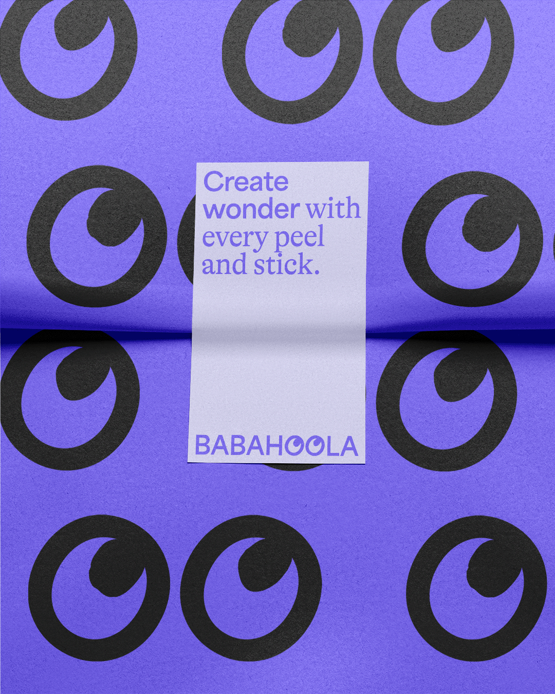
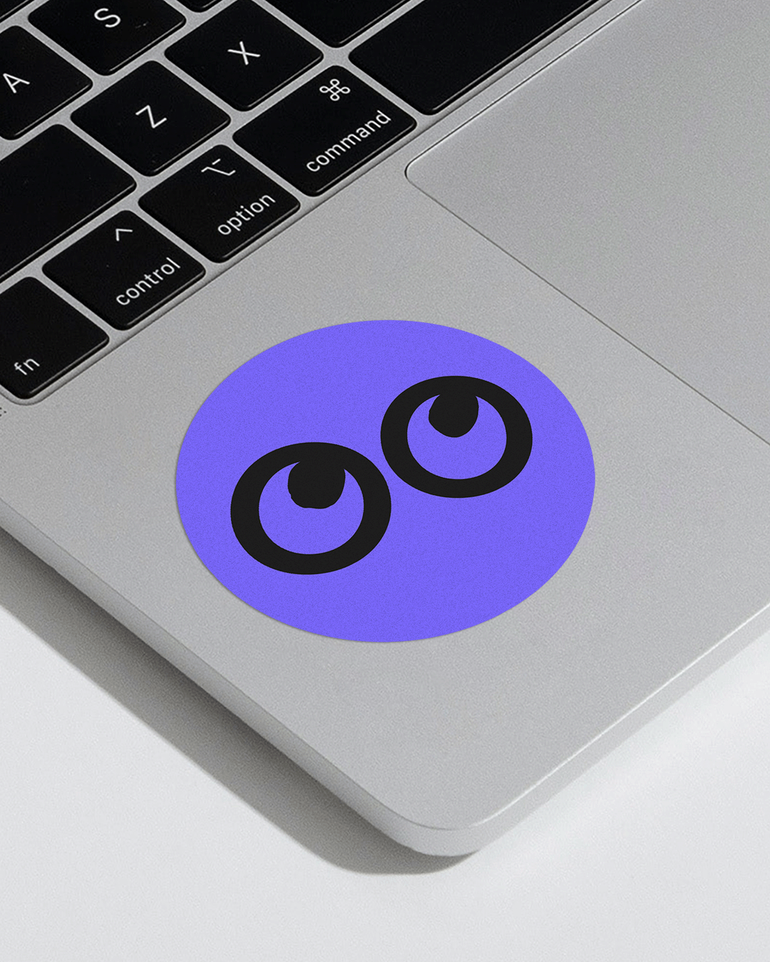
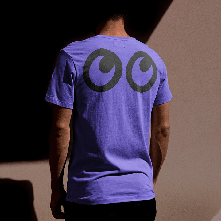
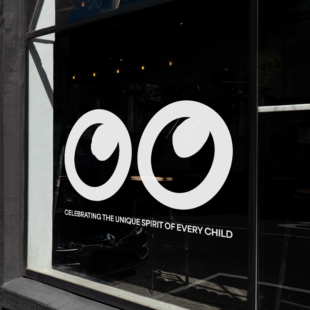
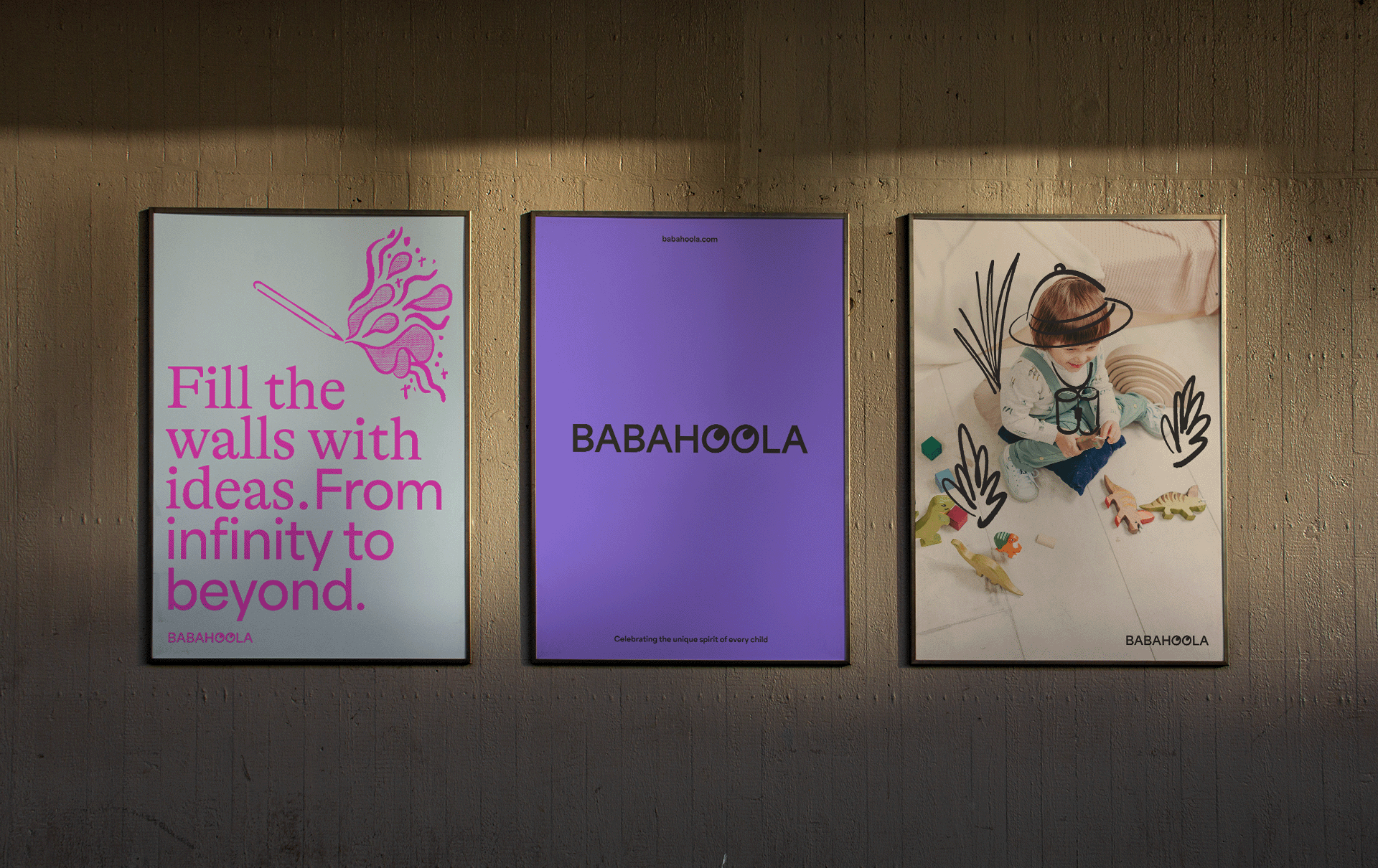
Our logo embodies the idea of discovery, with eyes sitting inside the wordmark itself. These are brought to life through motion, and also allow for multiple iterations too.
Although this is ultimately a brand that is for kids, it is interacted and enabled by their parents and guardians. This led us to create a two typeface system where the worlds of children and adults collide to create mixed and unique messaging, combined with a tone of voice that captures a sense of wonder and imagination, showing the emotional benefits as well as conveying the practicality of revitalising a physical space.
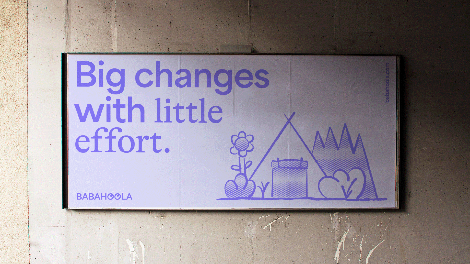
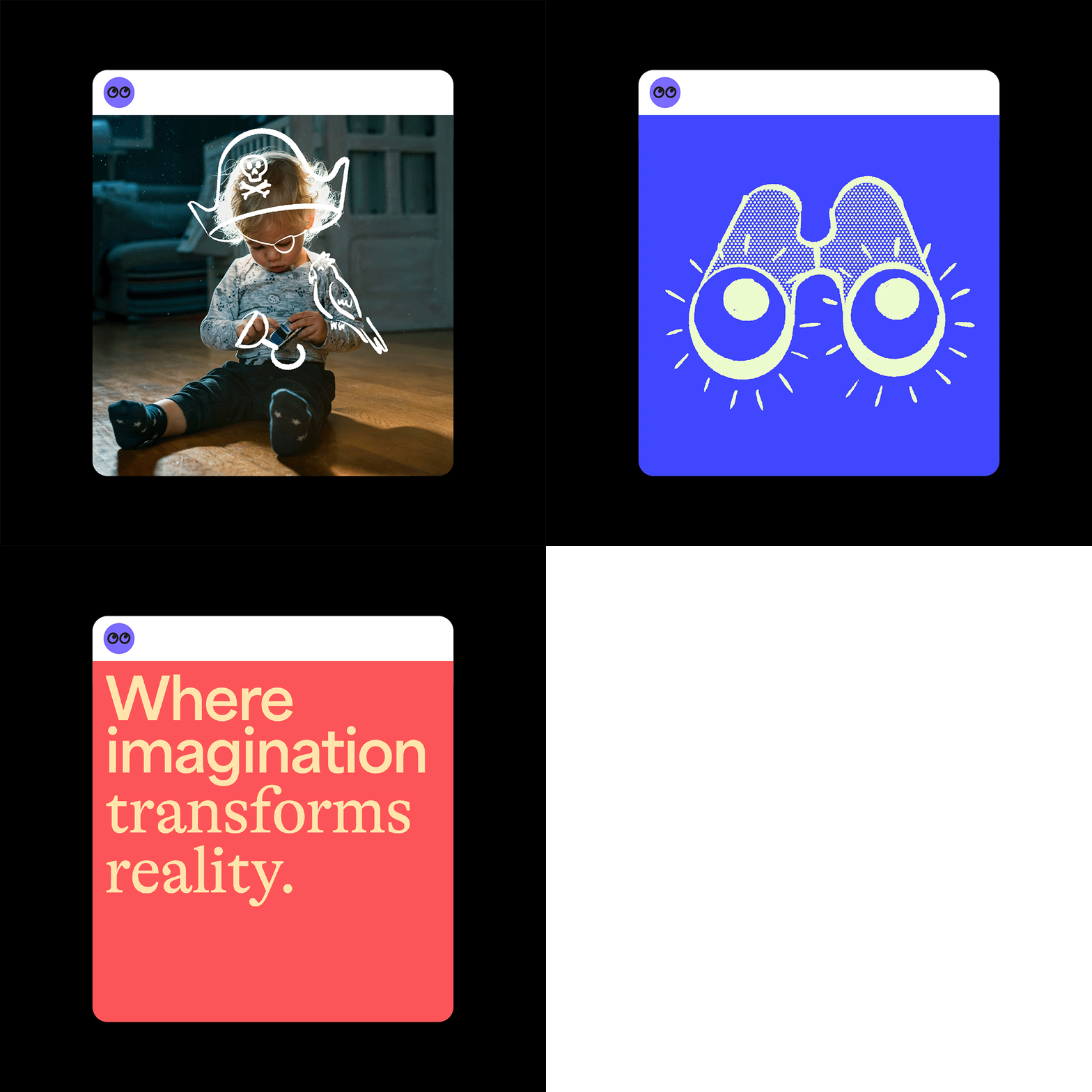
A textural illustration style sits alongside the rest of the simple system, providing a handmade layer reminiscent of a childs drawing, and is used both in isolation, but also directly over the top of our warm and joyful art direction. Through motion, these illustrations gain a sense of energy and are really brought to life.
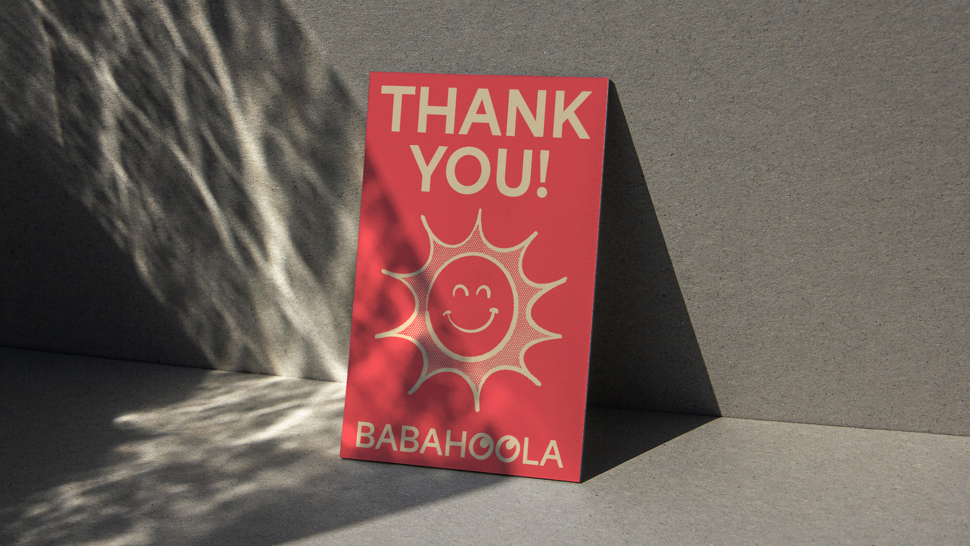
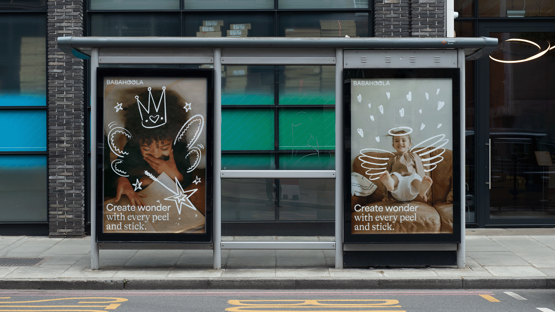
Our elements combine in endless ways to provide flexibility across all touchpoints, but all designed in a way that it has both a professional and a playful layer, which is what the brand tries to accomplish in every instance, from the textured illustrations over the warm art direction, to the stickers of the logo applied by hand over the packaging.
Animation and 3D work by Charlie Keeper


